CSS实现垂直水平居中
对于父元素 parent 与 子元素 child,如何实现子元素在父元素内部的水平垂直居中?
元素的 html 代码如下:
1
2
3
4
5
6
7
8
9
10
11
12
13
14
15
16
17
18
19
20
21
22
23
24
25
26
| <!DOCTYPE html>
<html>
<head>
<title>Document</title>
<style>
.parent{
width: 500px;
height: 500px;
background-color: aquamarine;
}
.child{
width: 200px;
height: 200px;
background-color: coral;
}
</style>
</head>
<body>
<div class="parent">
<div class="child">
</div>
</div>
</body>
</html>
|
flex 布局
1
2
3
4
5
6
7
8
9
10
11
12
13
14
15
| <style>
.parent{
width: 500px;
height: 500px;
background-color: aquamarine;
display: flex;
align-items: center;
justify-content: center;
}
.child{
width: 200px;
height: 200px;
background-color: coral;
}
</style>
|
行内元素居中
text-algin 与 vertical-algin 只对行内元素起作用,可以实现行内元素的的垂直于水平居中,此时可以利用 display: inline-block 使子元素具有行内元素的属性,实现子元素垂直水平居中 (需设置 line-height 使垂直居中有对齐的基准)。
1
2
3
4
5
6
7
8
9
10
11
12
13
14
15
16
| <style>
.parent{
width: 500px;
height: 500px;
background-color: aquamarine;
vertical-algin: middle;
text-algin: center;
line-height: 300px;
}
.child{
display: inline-block;
width: 200px;
height: 200px;
background-color: coral;
}
</style>
|
绝对定位 + 元素自身移动
通过 left: 50% 以及 top: 50% 只使得子元素的左上角位于父元素的中心,此时需要通过 transform: translate(-50%, -50%) 移动子元素。translate(x,y) 括号的百分比数据,会以本身的长宽做参考,比如,本身的长为100px,高为100px. 那填(50%,50%)就是向右,向下移动50px,添加负号就是向着相反的方向移动50%
1
2
3
4
5
6
7
8
9
10
11
12
13
14
15
16
17
| <style>
.parent{
width: 500px;
height: 500px;
background-color: aquamarine;
position: relative;
}
.child{
position: absolute;
width: 200px;
height: 200px;
left: 50%;
top: 50%;
background-color: coral;
transform: translate(-50%, -50%);
}
</style>
|
1
2
3
4
5
6
7
8
9
10
11
12
13
14
15
16
17
| <style>
.parent{
width: 500px;
height: 500px;
background-color: aquamarine;
position: relative;
}
.child{
position: absolute;
width: 200px;
height: 200px;
left: 50%;
top: 50%;
background-color: coral;
margin: -100px -100px;
}
</style>
|
利用 margin
1
2
3
4
5
6
7
8
9
10
11
12
13
14
15
16
17
18
19
| <style>
.parent{
width: 500px;
height: 500px;
background-color: aquamarine;
position: relative;
}
.child{
position: absolute;
width: 200px;
height: 200px;
background-color: coral;
left: 0;
top: 0;
right: 0;
bottom: 0;
margin: auto;
}
</style>
|
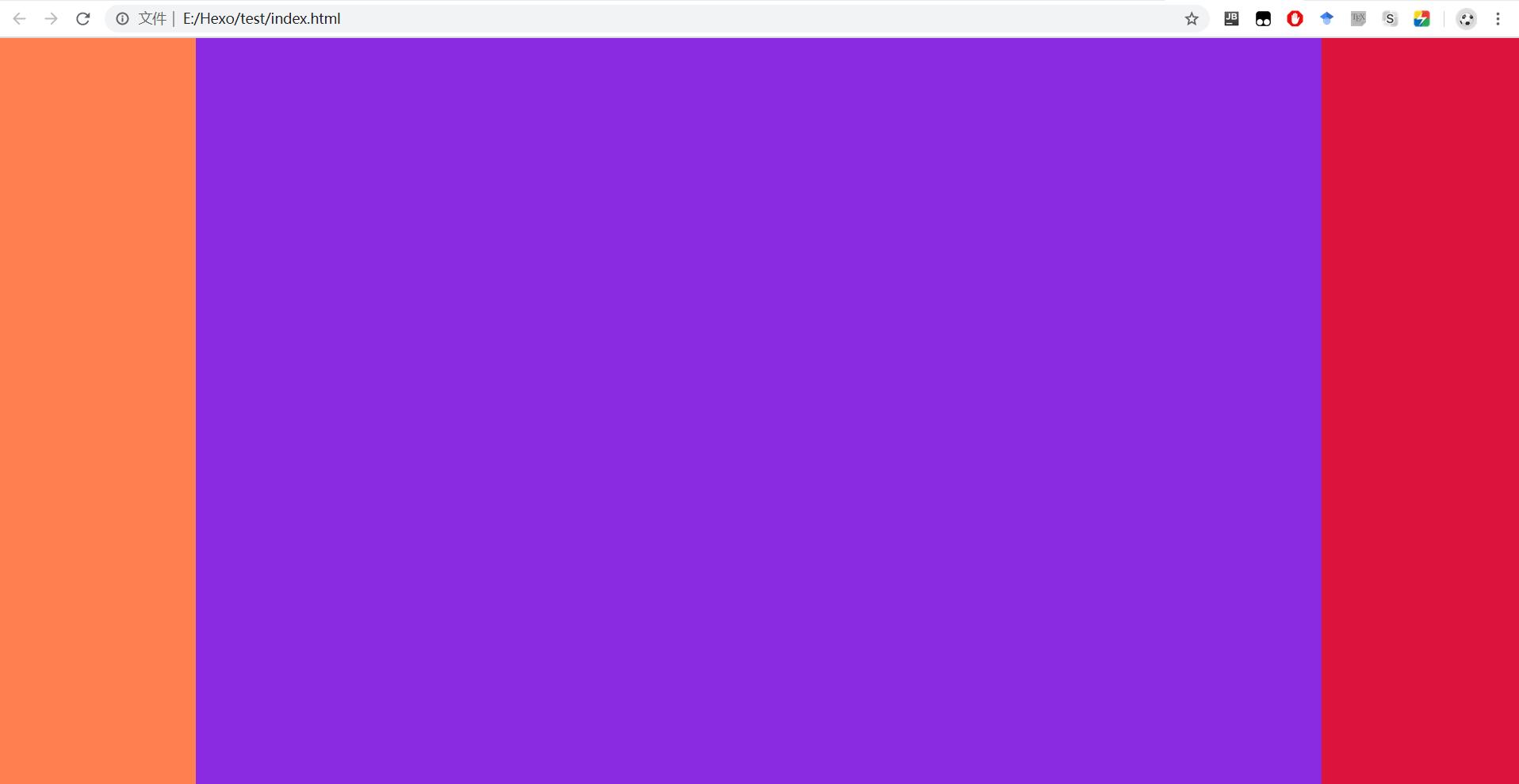
CSS实现三栏布局
所谓的三栏布局,既是指左右两栏固定宽度,中间一栏宽度自适应的布局方式。下面列出五种实现三栏布局的方式,分别是绝对定位、float方式、flex布局、圣杯布局、双飞翼布局。
绝对定位
利用绝对定位将左右两栏确定位置,中间一栏通过 margin 属性调整位置。
1
2
3
4
5
6
7
8
9
10
11
12
13
14
15
16
17
18
19
20
21
22
23
24
25
26
27
28
29
30
31
32
33
34
35
36
37
38
39
40
41
42
43
44
| <!DOCTYPE html>
<html>
<head>
<title>Document</title>
<style>
*{
margin: 0;
padding: 0;
}
body, html, .parent{
height: 100%;
}
.left{
position: absolute;
height: 100%;
width: 200px;
left: 0;
top: 0;
background-color: coral;
}
.middle{
height: 100%;
margin: 0 200px 0 200px;
background-color: blueviolet;
}
.right{
position: absolute;
height: 100%;
width: 200px;
right: 0;
top: 0;
background-color: crimson;
}
</style>
</head>
<body>
<div class="parent">
<div class="left"></div>
<div class="middle"></div>
<div class="right"></div>
</div>
</body>
</html>
|
float布局
float定位实现三栏布局的思想是:利用float将左右两栏固定位置,并利用margin控制中间一栏的边距,从而使其宽度自适应。
1
2
3
4
5
6
7
8
9
10
11
12
13
14
15
16
17
18
19
20
21
22
23
24
25
26
27
28
29
30
31
32
33
34
35
36
37
38
39
| <!DOCTYPE html>
<html>
<head>
<title>Document</title>
<style>
*{
margin: 0;
padding: 0;
}
body, html, .parent{
height: 100%;
}
.left{
height: 100%;
width: 200px;
float: left;
background-color: coral;
}
.right{
height: 100%;
width: 200px;
float: right;
background-color: crimson;
}
.middle{
height: 100%;
margin: 0 200px 0 200px;
background-color: blueviolet;
}
</style>
</head>
<body>
<div class="parent">
<div class="left"></div>
<div class="right"></div>
<div class="middle"></div>
</div>
</body>
</html>
|
flex布局
flex布局实现三栏布局的思想是:利用flex:0 0 200px固定左右两栏的位置,同时确保其不随浏览器的高度和宽度而放大缩小。 flex参数参照:https://www.w3cschool.cn/cssref/css3-pr-flex.html
1
2
3
4
5
6
7
8
9
10
11
12
13
14
15
16
17
18
19
20
21
22
23
24
25
26
27
28
29
30
31
32
33
34
35
36
37
38
39
40
41
42
| <!DOCTYPE html>
<html>
<head>
<title>Document</title>
<style>
*{
margin: 0;
padding: 0;
}
body, html, .parent{
height: 100%;
}
.parent{
display: flex;
}
.left{
height: 100%;
width: 200px;
flex: 0 0 200px;
background-color: coral;
}
.right{
height: 100%;
width: 200px;
flex: 0 0 200px;
background-color: crimson;
}
.middle{
height: 100%;
width: 100%;
background-color: blueviolet;
}
</style>
</head>
<body>
<div class="parent">
<div class="left"></div>
<div class="middle"></div>
<div class="right"></div>
</div>
</body>
</html>
|
圣杯布局
圣杯布局的原理是通过左、中、右列同向浮动,中间列宽度设置为100%实现宽度自适应,左右两列宽度宽度固定并通过位置控制实现分列左右两端。该布局可以实现中间布局的优先渲染,因为DOM结构上 middle 元素位于 left 和 right 元素的上层。
1. 首先父级元素设置内边距
1
2
3
4
| .parent{
padding-left: 200px;
padding-right: 200px;
}
|
2. 各自设置浮动方式及页面宽度
1
2
3
4
5
6
7
8
9
10
11
12
| .left{
width: 200px;
float: left;
}
.right{
width: 200px;
float: left;
}
.middle{
width: 100%;
float: left;
}
|
3. 左栏控制位置
1
2
3
4
5
| .left{
margin-left: -200px;
position: relative;
left: -100%;
}
|
4. 右栏控制位置
1
2
3
| .right{
margin-right: -200px;
}
|
5. 设置左右两栏的最小宽度
最小宽度并不是 200px + 200px = 400px,因为 left 元素采用了相对定位,其在 middle 元素上方还占有 200px 位置,所以页面的 min-width 参数为 400px + 200px = 600px。
1
2
3
| body{
min-width: 600px;
}
|
全部代码:
1
2
3
4
5
6
7
8
9
10
11
12
13
14
15
16
17
18
19
20
21
22
23
24
25
26
27
28
29
30
31
32
33
34
35
36
37
38
39
40
41
42
43
44
45
46
47
48
49
| <!DOCTYPE html>
<html>
<head>
<title>Document</title>
<style>
*{
margin: 0;
padding: 0;
}
body, html, .parent{
height: 100%;
min-width: 600px;
}
.parent{
    padding-left: 200px;
    padding-right: 200px;
}
.left{
height: 100%;
width: 200px;
float: left;
margin-left: -100%;
position: relative;
left: -200px;
background-color: coral;
}
.right{
height: 100%;
width: 200px;
float: left;
margin-right: -200px;
background-color: crimson;
}
.middle{
height: 100%;
width: 100%;
float: left;
background-color: blueviolet;
}
</style>
</head>
<body>
<div class="parent">
<div class="middle"></div>
<div class="left"></div>
<div class="right"></div>
</div>
</body>
</html>
|
双飞翼布局
双飞翼布局与圣杯布局的区别是:双飞翼布局的 parent 元素只包裹 middle 元素,left 元素与 right 元素通过控制与 parent的相对位置关系实现三栏布局。
1. 首先用 parent 仅包裹 middle 元素
1
2
3
| <div class="parent">
<div class="middle"></div>
</div>
|
2. 所有元素设置宽度与浮动
1
2
3
4
5
6
7
8
9
10
11
12
13
14
15
16
17
18
| .parent{
width: 100%;
float: left;
}
.left{
height: 100%;
width: 200px;
float: left;
}
.right{
height: 100%;
width: 200px;
float: left;
}
.middle{
padding-left: 200px;
padding-right: 200px;
}
|
3. 设置左栏位置
4. 设置右栏位置
5. 完整代码
1
2
3
4
5
6
7
8
9
10
11
12
13
14
15
16
17
18
19
20
21
22
23
24
25
26
27
28
29
30
31
32
33
34
35
36
37
38
39
40
41
42
43
44
45
46
| <!DOCTYPE html>
<html>
<head>
<title>Document</title>
<style>
*{
margin: 0;
padding: 0;
}
body, html, .parent{
height: 100%;
min-width: 600px;
}
.parent{
width: 100%;
float: left;
background-color: blueviolet;
}
.left{
height: 100%;
width: 200px;
float: left;
margin-left: -100%;
background-color: coral;
}
.right{
height: 100%;
width: 200px;
float: left;
margin-left: -200px;
background-color: crimson;
}
.middle{
padding-left: 200px;
padding-right: 200px;
}
</style>
</head>
<body>
<div class="parent">
    <div class="middle"></div>
</div>
<div class="left"></div>
<div class="right"></div>
</body>
</html>
|
 wechat
 alipay